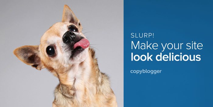
“We made the buttons on the screen look so good you’ll want to lick them.” – Steve Jobs
You’re creating great content to attract an audience. A loyal audience that comes to know, like, and trust you.
But what if you never get the attention of that audience in the first place?
What if your website visitors take one look at your well-written words and move right along because your page looks bland, boring, and amateurish?
You lose them at hello. Your words never have a chance to take root.
That’s where design can help. Design creates a welcoming first impression. It engages your site visitors and draws them in so they’ll actually spend time with your information.
It’s the difference between throwing some fast food on the table in front of your guests, and presenting a meal that’s carefully prepared, beautifully plated, and smells delicious.
Want to build up an appetite for your content?
Today’s post shares six design tips to make your website look so luscious, you’ll need to warn people not to lick their screens.
1. Think about your guests
Delicious design starts with an understanding of who you’re cooking it up for.
Knowing your target market and what they’ll respond to is crucial if you want to pick typefaces, colors, and images that will resonate with them.
What do you need to know about them?
Ideally, you have a grasp of their age group, predominant gender, and education level.
Bonus points if you are aware of psychographic details like what motivates them, what their beliefs are, and what other companies they’re attracted to and buying from.
And just like you’d want to know about food allergies before you prepared a meal, it’s important to be aware of what your target market finds unpleasant or repulsive so you can avoid it on your pages.
2. Speak their language with typography
Custom typography allows you to break out of the Helvetica-Times Roman-Georgia-Verdana fonts our sites marched in lockstep to just a short time ago.
You can express your brand or your website’s personality through your typefaces’ personalities.
Serif typefaces — the ones with little “feet” — are classic and traditional.
Sans-serif typefaces — those with streamlined letters — are contemporary and modern.
There are exceptions within these major categories, so trust your eyes to tell you what your typeface choices are saying.
It’s easy to use custom typefaces now. There are several good commercial offerings that will “serve up” unique fonts to your site. The Google Font API will even do it for free.
It’s an extra step, but custom typography will make your content stand out, and give your words personality.
Here’s more on choosing and combining typefaces.
3. Use colors that make sense to your market
If you’ve carefully researched your target market as outlined in step one, you may already have an idea of what colors will work for them.
To start, I recommend you choose two main colors to represent your brand.
For you, two colors are simplest to work with — you’ll have a short list to choose from every time you need to make a color choice.
For your audience, two predominant colors will make it easier to recognize and remember your brand.
How can you pick just two colors from the millions available?
Start by looking at the consumer goods your target market already buys. What colors already appeal to them?
You don’t need to walk around your local shopping mall with a swatch book, but keep your eyes open to color combinations that are already being used to sell to your particular market. Take inspiration from what’s already working.
4. Tell your story with enticing images
I’ll be the first to admit it: finding a good image to work with your posts is a huge pain.
It adds to the time it takes to finish your article, and — because you typically look for an image after you’ve finished writing — it feels like just One More Thing To Do.
But, the payoff is worth the effort.
As wonderful as your carefully-crafted words may be, they’ll sit there limp and lonely on the page if you don’t pair them up with a compelling image.
A great image is like the cover of a dinner party invitation.
It gives people an easy “in” to start engaging with your writing. Images are processed quickly, and if you’ve picked one that’s attractive and creates just a little bit of curiosity, it will draw readers into your headline and the first paragraph of your post.
5. Order your information hierarchically
Visual hierarchy helps your visitor navigate through your page and absorb your information in the order you prefer.
Sounds confusing, doesn’t it? Here’s how to make it work …
Look at the information on any given page of your website. What do you want your site visitors to notice first? It’s probably your site name.
Then what do you want them to see? It might be your headline, or the image you’ve used with your first post.
Once they’ve taken in the name of your site and you’ve drawn them into your content, then where do you want them to look?
Visual hierarchy directs the viewer’s eyes through your information by giving it an order of importance by where it’s positioned, how bold or bright it is, and how much white space it has around it.
The most important information? Make it larger, bolder, and brighter. Give it some breathing room, too: white space draws eyeballs.
The next-most-important information? Make it smaller, less bold, and not as bright.
As you move down the ladder of visual hierarchy, remember: the less important the information, the less visual “weight” it should carry.
6. Keep it together with a style guide
OK, you’ve used color, typography, gorgeous images, and visual hierarchy to create lickable, luscious pages.
Now what?
Keep up the good work!
Maintain consistency with a simple style guide. It doesn’t have to be a complex 20-page document.
Try this:
- Open any word processor, and note your official colors
- Log your typefaces, and which font you use where
- List the file name for your official logo or header artwork, and where it can be found
- Note any resources for photography so you know where to find more of a style you’ve used in the past
- Continue to add to this document as you make design decisions about your website
Once you’ve created an attractive website, keep people coming back to it by serving up beautifully-presented content consistently over time.
Make good design decisions, then continue applying them using your style guide notes as a reference.
And don’t forget the “please don’t lick your screen” sign. You’re going to need it!
Get beautiful design at a 30% discount during our StudioPress Blowout Sale
Until the offer expires on Tuesday, August 30 at 5:00 p.m. Pacific Time, get 30 percent off everything we sell at StudioPress.
StudioPress premium WordPress themes are already a great value. You’ll enjoy the built-in security and stability of the original premium WordPress theme framework, plus you’ll save thousands over what a custom design is likely to run you.
At 30 percent off, the value is even better.
To start shopping for individual themes now, simply click this special coupon link:
http://my.studiopress.com/coupon/blowout-discount/
IMPORTANT: You have to click that link to receive the discount.
You will see the discount applied on the individual theme pages and at checkout.
Editor’s note: The original version of this post was published on August 30, 2011.
The post 6 Website Design Tips that Will Have Your Audience Licking Their Screens appeared first on Copyblogger.
No comments:
Post a Comment